Introduction
Lead generation provides value towards your customer relationships and sales cycle.
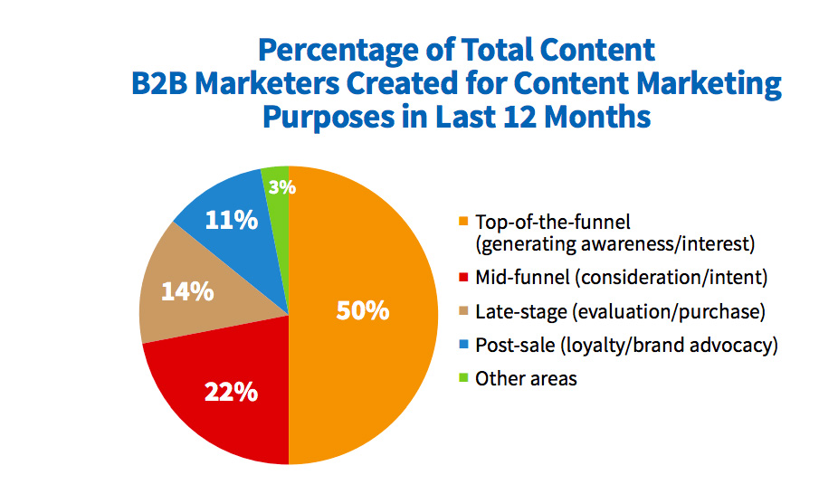
In fact, 50% of B2B marketers devote their content marketing efforts to lead generation content.
Lead generation content, well… generates leads. Your leads are your future buyers. Once you have a list of prospects, you can nurture them through your funnel and make sales.
This type of content is effective if new users have access to it.
How do you expose your lead gen content?
Here’s an idea – create a lead generation landing page.
In this post, you’ll learn what a lead generation landing page is, why you should create one, and how to do it.
Why Should You Create A Lead Generation Landing Page?
A landing page is a giant call to action. In this case, a lead generation landing page convinces users to read your lead gen content.
Plus, it gives you the name and email address of your future buyers.
An email address unlocks the door to the rest of your content. Once you have an email, you can send a variety of relevant content right to their inbox.
Why is this important?
When you send valuable content to your prospects, they’re constantly reminded about your business. They’re also learning about you and getting comfortable with your brand.
Once they feel comfortable, they’re more likely to buy your service and become a long-lasting customer.
79% of B2B marketers agree that email is the most effective channel to nurture leads into sales.
Keep this in mind – most users won’t give away their email for no reason. They need an incentive, aka, your lead gen content.
Here’s a list of the most popular B2B lead generation content:
- Ebook
- White paper
- Case study
- Webinars
… you get the picture. There’s a variety of content you can use to convince users to enter their email address.
To get to the point, a lead generation landing page builds you a list of future buyers.
Your future buyers will continue down the funnel as you send them content and info about future webinars, products, etc.
They’re a key part of increasing your sales and finding long-term customers.
Who wouldn’t want that?
What Makes A Lead Generation Landing Page Convert?
- Title
- Subheading or Description
- Call to action
- Signup form
- Other features
So you know what a lead generation landing page is and why you need them.
How do you get started?
A converting lead gen landing page has the following elements –
- Title
The title of your landing page should be short and specific. Make sure to hook your reader right from the start.
- Subheading or Description
The length of your lead generation landing page will decide whether you’ll write a subheading or description.
A subheading is an extension of the headline. They’re usually short and sweet. Descriptions are a longer version of a subheading.
Both of them answer the following questions –
- What are the benefits of your lead gen content?
- How will it solve your audience’s problem?
- Call to action
Your call to action should tell the user to do something (ie. read your whitepaper). Make sure it convinces them to take the action you want.
Avoid using standard CTAs like, “submit” or “download.” These are overused and impersonal. Instead, use active and personable language.
Need an example?
Let’s say you’re a life coach and wrote an eBook about finding your company’s strengths. Instead of using “Download an eBook today,” try, “Discover Your Business’ Strengths.”
Do you see how much more personal the second CTA is? It tells users to do exactly what your book will help them with. Your audience will feel like you’re talking directly to them.
- Signup form
Your signup form is where you ask for a name and email address. If you want to grab more data about your prospects, you can ask for more information.
Keep in mind that a new user might be hesitant about submitting a bunch of personal information.
You can assure new users and mention your privacy standards under the submission form. This tells users you care about their privacy.
- Other features
Landing pages can also include features like testimonials, images, video, etc. These features shouldn’t be chosen at random.
What elements will convert your audience the most?
If you don’t know the answer, A/B test your features and find out what works and what doesn’t.
On that note, the following 5 examples of B2B lead generation landing pages will teach you –
- What high converting lead gen pages look like
- What converting elements you should use
- Inspiration to create your own lead generation page
Let’s get started!
5 Examples of A Lead Generation Landing Page
- Litmus
- ActiveCampaign
- Drift
- Asana
- Optimizely
1. Litmus
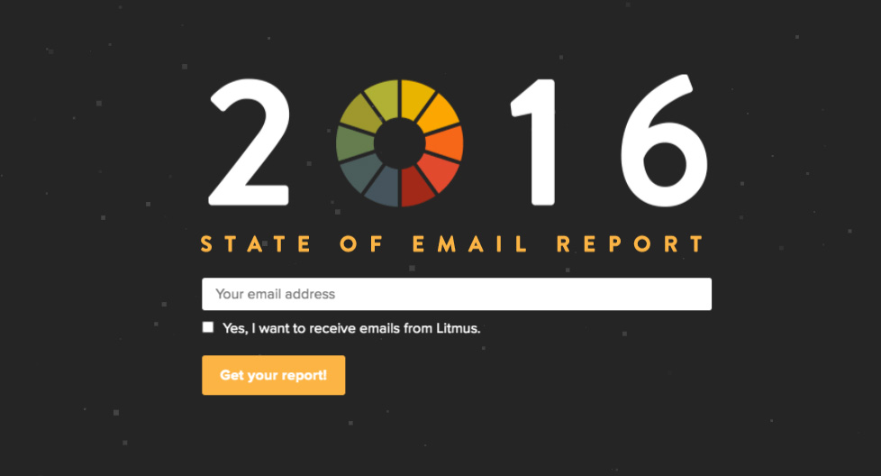
We’ll start off with a simple, yet converting lead generation landing page.
This is a great example of a landing page with no fluff, aka, unnecessary info. The headline is large and direct. Plus, the submission form is simple.
The Highlights:
- Brand colors
The best part of this landing page is the dark background. Your eyes instantly focus on what’s being presented to you.
- Call to action
Notice how the call to action isn’t boring. This CTA targets the point of this landing page – to download their 2016 report.
- Choice
Many users might shy away from a lead generation landing page because they don’t want to enter their email. It’s understandable, we’ve all had terrible experiences with spam.
Litmus gives users the choice to opt-out of their mailing list. Your first thought might be, “Well doesn’t that defeat the whole point of this landing page?”
Not quite.
This opt-out form creates trust with your audience. It shows that you care about their preferences.
So, maybe Litmus won’t get the same amount of subscribers, but they’ll build trust with new users right from the beginning.
What Could Be Better:
What is their 2016 email report about?
We have no idea.
This page could use a subheading to describe what their report is and why their audience wants to read it.
You should always tell your audience what they’re getting into.
2. ActiveCampaign
ActiveCampaign used a lead gen landing page to promote their free trial. Free trials are a great way to generate leads if you’re in the B2B tech or SaaS space.
The Highlights:
- Headline
ActiveCampaign hits the nail with their headline.
It tells users, “I have something that’s even better than email automation… AND your customers will be happy.”
Also, the benefit is clearly listed in their headline – to boost customer experience.
- Subheading
This section restates the benefit and how it solves a user’s problem.
Notice how the subheading doesn’t use jargon. Unless you’re targeting a specific audience, avoid technical vocabulary in your landing pages.
Stick to active and easy to read words instead.
- Small print
The best part of this page is the small print under the signup form.
Three more benefits are included here. This small print catches anyone who isn’t sure about signing up.
This is a creative way to reassure and get rid of any hesitations a user might have.
What could be better:
Everything on this landing page looks good, but it wouldn’t hurt to show credibility with testimonials.
3. Drift
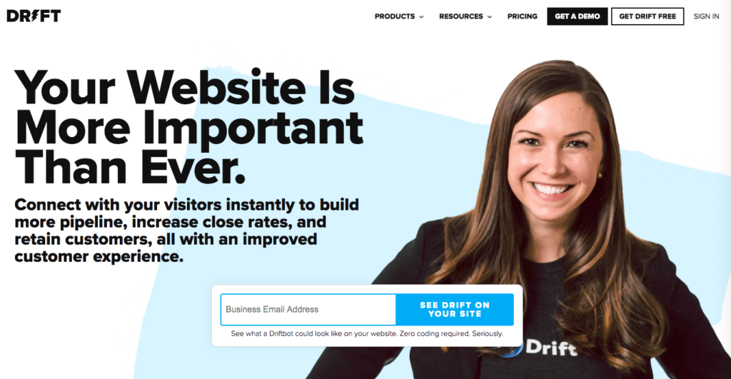
Another lead gen tactic B2B tech and SaaS use are free demos. Free trials and demos both offer a real-life experience for their audience.
The Highlights:
- Personable photo
It’s been said that photos of human faces builds trust with an audience.
A photo puts a face to your brand. It helps customers think of you as a human (because you are one).
Consider using photos of yourself or your team on your next landing page and A/B test it. This will give you a definite answer on if your audience likes photos.
- Call to action
Drift’s CTA is direct and unique. It tells users exactly what they’re signing up for.
Remember, you should tell your audience what to do next with a call to action. Direct them to your services.
- Headline
This headline is the definition of catchy.
Sure, it doesn’t state the benefit, but it holds your attention. It makes users think, “Yeah, you’re right, my website is important!”
Don’t be afraid to create a bold heading. Use a shocking statistic or question to get your user’s attention.
You can always use your subheading to state the value and benefit of your product.
What Could Be Better:
This may sound nit-picky, but there’s one small element on this page that can lose many conversions.
The top navigation bar.
A navigation bar invites users to leave your page. It also distracts them from your copy.
Try to minimize all distractions on a landing page, including navigation bars.
4. Asana
Asana uses two landing pages to get a user’s email address. The first one leads users to the second page.
If you decide to build two pages, make sure the second page loads fast. The last thing you want is a user to leave your page if it takes too long to load.
The Highlights:
- Testimonials
Asana placed logos of companies they’ve worked with on the first page. Notice the small print above, “Trusted by the world’s best teams.”
The print may be small, but it’s impactful.
Who wouldn’t want to work with a business who has the world’s best clients?
- Headline
This landing page is focused on remote businesses. These businesses want to keep their remote team organized and tight-knit.
This headline targets their audience with a valuable benefit – to keep remote teams organized and working together.
- Layout
Notice how their first landing page copy is set up. Your eyes can easily go from the headline all the way to their testimonials.
Plus, the white background is clean and helps you focus on the copy. It also makes the purple CTA button stand out.
What Could Be Better:
As I mentioned above, the two-part landing page can lose visitors if your page doesn’t load fast enough. They might lose interest and forget the whole thing.
If possible, keep your landing page in one piece. This avoids distraction and loss of conversion rates.
5. Optimizely
As a B2B company, you’ll probably create a whitepaper landing page, if you haven’t already. Whitepapers are a useful lead generation tool to educate your audience.
The Highlights:
- Description
Notice how this lead generation landing page uses a description vs. subheading.
Long copy gets a bad rep. Many people think their audience don’t have the attention span for a long description.
It isn’t about how long your copy is, it’s about what’s in your copy.
Optimizely’s copy is written in perfect order. They start off with the reader’s pain points and explain the value of their whitepaper. To wrap up, they end with a list of benefits.
Every sentence in this description is important. There’s no fluff, only value.
When you write a description, think about how valuable each word is. User’s don’t have time to read useless information. Make every word count.
- Signup form
Optimizely organizes their signup form into two steps. This makes the process simple for users and avoids overwhelm.
An opt-in checkbox is also included at the bottom. The option of opting into their email list builds trust.
Remember, users want to feel included.
- Testimonials
It’s hard to read past Optimizely’s testimonials – they take up a large part of the page. Plus, they added a noteworthy statistic at the top.
Who else works with 40% of the leading interband companies?
Not many.
If you have a noteworthy statistic about your company, use it on your landing page.
What Could Be Better:
Their call to action is standard. “Download the Optimization Survival Guide” isn’t very creative.
In addition, this CTA is placed towards the top right of the page. The top of the page usually has the headline or informative copy, not the call to action.
Imagine walking into a store and getting bombarded with a sales pitch. Wouldn’t you rather walk around the store and learn about it before making a sale?
Inform and educate your audience before you sell.
If you decide to place your CTA’s on other areas of the page, A/B test and make sure it’s still converting users.
The Takeaways
If you’re going to take anything valuable from lead generation landing pages, it’s these 3 things:
- Lead gen landing pages jumpstart your B2B funnel
Like I said before, the point of landing pages is to convert.
In this case, lead generation landing pages convert new users to leads. Leads are more likely to go through your funnel and make a purchase.
- Your audience is #1
It’s easy to get caught up with designing a beautiful landing page. Beautiful landing pages only convert IF it’s targeted to your audience.
Focus on your audience’s pain points, desires, and stage in the funnel (lead generation). Use this info to create personal and effective landing page copy.
You should also A/B test features to make sure you’re on the right track.
- Every feature counts
A high converting landing page only uses features that convert. Don’t get caught up with what looks good, focus on what works.
Every word and design element matters. Focus on giving as much value as you can to your audience. They’ll be thankful you did.

Gaurav Roy
27 July 2020
Our blog
Latest blog posts
Tool and strategies modern teams need to help their companies grow.

This comprehensive guide covers everything about service marketing—its unique chara...

Sophia Westfiel

Believe it or not, the concept of content sharing existed long before the Internet. I...

Stacey Wonder
Sales analysis is essential to avoid inaccurate forecasts and identify improvement op...
